Packaging Design Case Study
Packaging is vital because, at times, before a customer experience your product functioning they see how it’s packaged. Studies have proven that packaging drives purchase intent, product satisfaction and repeat purchases. To really stand out, compelling brand packaging is what it will take.
From its introduction into the market in 2001, the Tru Juice packaging has always sought out to be both a form of function and attractiveness. The ‘short’ 475ml (16 FL oz) version of the original rollout had most of the island transfixed with not only the shape of the plastic bottle but the look and design of the labelling. Each bottle had a specific label which featured: images of the fruit used, the written ingredients of the juice’s composition and a P.O.S barcode. In addition, to the 475ml (16 FL oz) Tru Juice also released the 945ml (32 FL oz) and 1.89L (1/2 Gal) sizes who both replicated the label design and corresponding colour scheme.
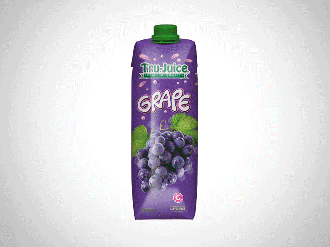
The Tetra Pack line was subsequently expanded to include both the 500ml and 1L sizes and featured a few significant updates to the mini tetra pack’s design. Gone were the bright colour design variation, playful fonts, covered hole and attached bendable straw to be replaced by a solid white design base, businesslike font set and twist bottle cap. A clear change in market focus as larger sizes means older demographic and hence a more mature narrative was used to connect.

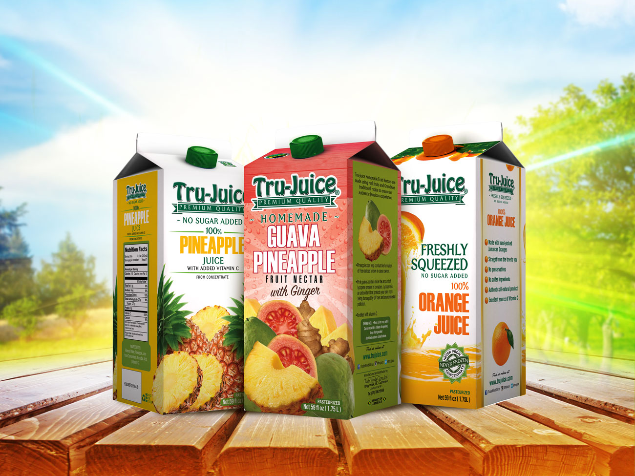
Named in reference to the process of opening the packaging, most are opened by pushing the gables at the top back and pulling the top (spout) out, the Gable Top carton design is a fairly new one employed by Tru Juice. This model is normally at the 1.75L (59 FL oz) size and were made to be kept refrigerated and in terms of layout, the Gable Top has a white design base with the fruit used prominently displayed at the front with the solid colour highlighted at the sides with the nutritional facts and other essential information fully on display.
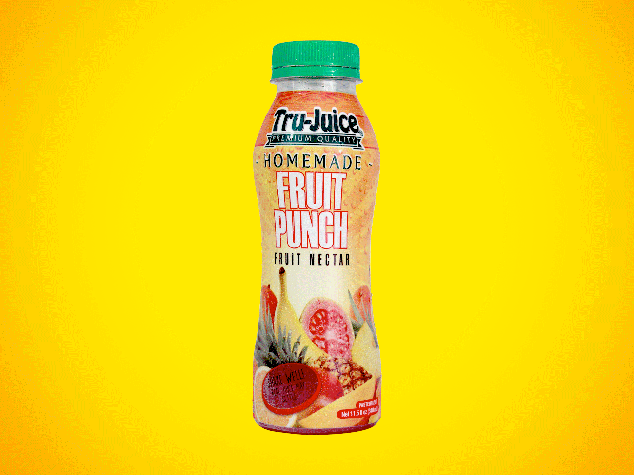
Tru Juice in an effort to become more socially responsible brought out a new packaging set focused on helping to decrease their carbon footprint on the island. PET (polyethylene terephthalate) is a form of polyester that is molded into plastic bottles, PET bottles have the distinction of being the most widely recycled plastic in the world. Pretty cool, right? However, it is as important to also to create a package that draws people in, as it is to be good for the environment. A feat that Tru Juice definitely achieves with the look of the PET line. This 340ml (11.5 FL oz) bottle fits right in your hand and features a white base with an attractive selection of fruit imagery at the front with the nutritional facts and other essential information showcased at the back.